
Statement of Intent
My chosen theme for my GCSE level photography portraits. In more context, I will be focusing on capturing black and white portraits that are simple but remarkable. I have decided to do this theme because I believe that the black and white feature makes your photographs look elegant and that is my goal that I would like to achieve, this will also make me explore different ways to capture my desired image such as using different patters, different angles and different angle techniques. For my final gallery I would like to turn my best images into magazine covers because that is also my goal.
To make my work the best it can be, I will carry out different research methods of my theme Portraits. I will research some of my chosen Photographers that specializes on black and white photography and also a mix of colourful and creative portraits try my best to recreate some of their images. For example Magdiel Lopez because he takes simple but remarkable images and it would feel great if I can achieve to recreate some of his photographs. This will inspire my own outcomes because I would try my best to top his work and this will bring out some of my best abilities which will makes me and even better photographer which will earn me a high grade.
I was very glad to hear that we will be doing portraits and I was even more glad that I was allowed to do them in black and white. I believe that I will succeed in this theme because I enjoy it so much and this will bring out some of my best abilities. I have expanded my ideas for this theme by choosing different ways to accomplish this theme such as; I will photoshop one of my black and white images and add some colorful edits to them to make this photograph stand out which is what I want to achieve.
To start my progression through my work I will start by photographing my friends at school, then I will edit these images into black and white. I would like to take studio shots since I believe that it would make the photographs look more elegant which will fit my goal. I would capture my photographs in different angles and I would then edit them using photoshop to make the picture stand out more. I would then edit them to make them look like magazine covers which is my number one goal.
I would like to use a wide range of techniques so I know that I haven't wasted my abilities. I have a manual DSLR canon camera which I will take many of my photographs on. In many situations I have had the opportunity to use a telescopic lens which has been a blast to use. I will try to push myself to be a lot more creative on photoshop to better my photos, I will try to learn how to layer images and how to blur the background of some images.
I have three months to construct my work towards my final piece. I aim to complete my initial research within the third week and start photographing by the fourth week in order to give me the time I need to show my progression in my work. I will then develop my work in photoshop and capture some more images when I next go outside. When I have completed the project, I will select my best photography outcomes and display them in my final gallery with my evaluation at the end too.
As my project increases I will use annotations to show my ideas and developments clearly on my webpage. This will help me because I will be able to see any of of the mistakes I made and this will help me improve them. I'll most likely get support from my class peers and my teachers, I will also watch tutorials to help me too. After I've finished my final page, I will write a final evaluation reflecting my project as a whole, reflecting on what went well and all of the mistakes I made, which will help me improve
Mood Board
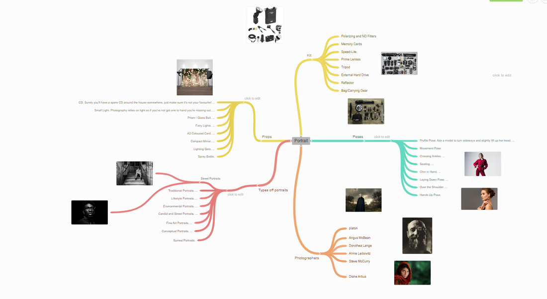
Coggle
Magdiel Lopez

Context:
This photo was made by Magdiel Lopez (who is a photographer). He was born on the 28th of August, 1989 in Havana. Magdiel Lopez spent his younger years surrounded by the Cuban culture which has inspired his very bright, colourful and unique style. Lopez is an artist who specializes in digital and print work. So he takes a photo and edits it with a range of special effects. I strongly believe this image was inspired by his childhood as it is very vibrant and quite unusual. You can see by looking at this picture his style and imagination is very unique to other artists.
Content:
This photo is called Perder O Ganar which in English means to win or lose. Lopez wanted to show a meaning through art. When I first saw this image I could just see some type of world inside a head which was broken apart. However, when I learnt what the title meant and more about the artist I could see and feel the power the image holds. It shows how sometimes you may fail or it may work out. I love how Lopez shows what's happening in people's minds. You can see through this image especially how he takes modern art and portraits and blends them together. The use of a neon colour palette and extremely bright colours is to draw the viewers eyes they just really pop out.
Composition:
Lopez arranges his work out in a way which captures the viewer's eye. In this specific photo his model is looking directly into the camera which creates a very strong and powerful effect. He has placed his model in a rule of third and not directly in the middle so he has really embraced the space in his photo. When editing his photos he has split the head in even layers which makes the photo seem very neat and organized and really emphasizes the power and strength of the image. Even though he has edited his photo I can still see this photo was taken in a studio. I think he may have used a tripod as the photo is extremely centered and clear. He has used a very fast shutter speed to create that sharp photo and low ISO to around 200 to get that better quality photo. He purposefully centers the images and tell the model to tilt his head slightly to make the photoshop come out a lot better and also dulls the light slightly to make the figure off the model pop out a lot more.
Comment:
When I first saw this image I thought the use of vibrant colours was really effective as I instantly wanted to look at it. Furthermore, I also really liked the unique style the artist has and how he shows a story through his work. I will link to Lopez's work because I will take pictures of bright objects and edit them. I am also beginning to look at portraits.
Research On Steve Mc Curry
Context
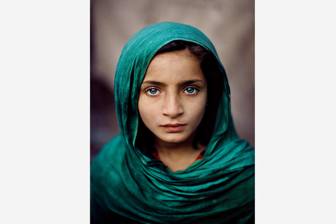
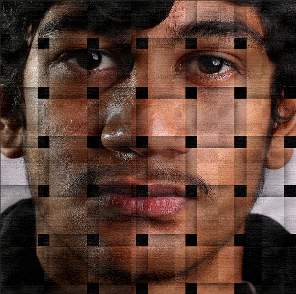
"Steve McCurry (born 1950) is best known for his evocative colour photographs that document both human struggles and joy. Having travelled the globe for over thirty years, McCurry has photographed warzones, burning oil fields, refugee camps, ship breaking yards and monsoons all over the world. He brought the world the first images of the conflict in Afghanistan, including his celebrated image of the Afghan Girl, Sharbat Gula, that has become one of the world's most iconic photographs. His work spans conflicts, vanishing cultures, ancient traditions and contemporary culture."- I found this off the following website: https://huxleyparlour.com/artists/steve-mccurry/
COMPOSITION
In this photograph by Steve McCurry I can see that he has used several compositional techniques to draw our attention to the face of the young girl. He has placed the points of interest, which are the eyes, onto the intersections of the grid, symmetrically in the middle but also on the sweet spot. This creates a big impact when looking at the photograph. The use of color enhances the image with the green of her headscarf standing out from the pale purple background. She also has very green eyes, perhaps the photographer did this on purpose to stand out and show sympathy to the audience. The image is also tightly cropped with the face of the young girl very close to the picture plan and it is as if we could reach out and touch her. This cropping helps us to make a connection with the image and to be drawn into it. The light source seems to be coming from the front as most of her face is lit, MuCurry may have used a reflector to bounce the light onto her face. The scarf frames her bright face by creating a dark shadow on the right hand side of her which makes her face stand out more. In my opinion, I think the shutter speed would be quite fast as the image is crisp and in focus, he may have used a 50mm lens and the F stop , F8.
CONNECTIONS
The essential soul peeking out, experience etched on a person's face. This inspires me to take photos of unique things like warzones showing how people suffer throughout. Its amazing how he has thought of such an idea it makes it so appealing to the eye. I would like to do the same using a canon camera to take photos of something that's related to Steve Mc curry photography. I will follow the theme of disturbing and compelling. I like the way how the frames have been shot and cut out for that sweet touch to the photos
COMMENT
I like Steve Mc Curry's work as its got a special meaning to it. It shows the world what people
go through but through pictures and not videos. Broke homes scars and blood; It shows it all. A very good picture was taken by him in Pakistan of a girl with bright green eyes this was a very famous shot it showed the sadness in they girls eyes. You could see tears in her eyes showing it was an unfortunate event that had occured . I love how Mc Curry took risks to show the world what under developing country's are having to go through
Mateusz
Context:
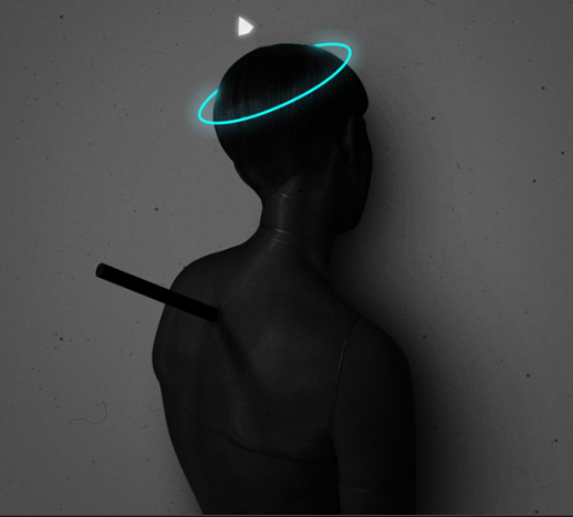
"This photo was published on February 8th 2018 on this website (Mateusz Lengling Art | purple woods) and the Photographer Mateusz Lengling is based in Poland. Lengling is a painter and photographer and his photos stem from digital collages and dark surrealism. He currently studies at The Academy of Fine Arts in Gdansk. This photo is an example of surreal photography which generally represents unconscious dreams, ideas and emotions. Surrealism tends to be “dreamlike and tap into people’s subconscious” (quote from: How to do surreal photography) and a main factor of surrealism is to make sure to “break the rules on purpose” and not only by accident (see previous link for quote source)"- I got this infomation from the following website: https://www.pinterest.co.uk/aq182848/mateusz-lengling/
Content:
While there was no description of this photo on the specific website, in the portrait it is clearly someone facing a wall with what looks like possibly a knife in their back. As well as this, the neon ring around their head could imply that they’re dead or an angel in general. This work could represent maybe some form of betrayal from the knife or object in the back, or maybe someone being saint-like as the halo and the “knife” in the back could represent someone being self-sacrificial and forfeit themself for somebody else. The pyramid above the person’s head, following Egyptian symbolism, could represent the mound of Earth from which the Egyptians used to believe the Earth was created from. This photo does not have a title however it is in a group of collages by Lengling. It is a realistic photograph and I believe the “halo” and the pyramid above the person’s head are emphasized intentionally as the rest of the image is mostly dark so the bright colours stand out more. A common theme among this collection is faces mostly or completely covered so maybe Lengling is trying to convey anonymity or since a lot of the images contain technology covering their faces maybe he is trying to convey that modern technology has added a new layer of anonymity to our lives and that not everyone online is quite what they seem.
Composition:
A central focal point has been used well here, with the subject standing almost directly in the centre of the frame. I think it was well done that only one person was in the frame as it gives the image a sense of isolation which could convey the image’s tone. The frame also isn’t overly full since there’s only one person and it immediately draws your attention to the person.The photo is clearly framed to be this way so that nothing draws your attention away from the subject. Lengling may have used a tripod however it is not obvious if he has. I believe Lengling may have used a lower white balance, but not too low to capture the full effect of the image, with both the darkness and then the neon light. I believe that Lengling used a high aperture as all of the details in the photograph are in focus and nothing’s out of focus. I also believe a high ISO may have purposefully been used as you can see some noise as part of the photo and I believe it adds more to the dark background, giving it more of a texture. As the image is titled as in a group of digital collages, and after further investigation of the collection, I believe that the neon “halo” and pyramid have been edited, so therefore I believe a shutter speed of possibly 1/1000 was used as the image doesn’t look blurred.
Comment:
I believe this work can have many implications and interpretations and that’s what I like about the photo-it can tell a story. I dislike how dark the photo is but I do realize that if it wasn’t as dark it wouldn’t be as effective or impactful. I like the blatant contrast in the photos, the vibrant neon against the generally dark images. I also like that the photos all seem to have stories behind them or implications. A theme among his work is dark colours and contrast, neon contrasting against dark colours or dark colours on a subject contrasting and juxtaposing against a bright background which really emphasises the subjects of his portraits. From this in future shoots I would like to imitate or incorporate the juxtaposition of colours that Lengling uses, as well as also using neon lighting as I believe it creates a very futuristic effect that I think would look good in my photographs.
Salford Trip
Shoot Plan
Plan for Shoots
Name:
Taking images of the whole class and many sceneries
Project Title/ shoot number:
Salford Quays Shoot
Description of aims for shoot:
Fashion Portrait Shoot to capture the Salford skyline and my model(s) with excellent composition and definition.
Location: Salford
Kit needed e.g. lighting, tripod, backdrop, macro lens:
Studio Shoot.
Camera and sunlight as any others would be pointless
None as it will be outside where we are moving constantly making it impractical to take props.
Camera settings I will use:
F/4.
Daylight and Cloudy ; swap around between the two due to the fact that Manchester weather is quite unpredictable - it switches between sunlight and cloudy every few minutes.
About a shutter speed of 1/100 to 1/1000 depending on how bright where we take images on is at that moment eg; on a bridge with quite a lot of sunlight it will be on the lower end of the spectrum but not too low as to not make the image too bright.
ISO 100 or ISO 400 to create a noisiness in the background, drawing the viewers eyes to the vocal point (being my model)
Which compositional rules will I use?
The rule of thirds to capture my artist in one third, and two features of the skyline in the other thirds ; worms eye view to be able to include my artists whole outfit and footwear ; and central focal point to catch my viewers attention to my subject.
Imran


Best and Worse

|

|
The image on the right is my favorite image as the quality and pose off it is just amazing where as the image on the right isn't focused and isn't as clear and doesn't have a main focus point.
Zuhair


Best and worse
|
|

|
The image on the left is my favorite as best out of the rest as I have framed it through the leaves and made a frame. The image on the right is pointless and has no background and no context and is a portrait of his face and the portrait isn't the best.
Muj


Best and worse

|
|
The image on the left is the best image as it has a effect off him drinking water and it looks very nice and focused upon where as the image on the right isnt focused at all and he isn't posing or doing anything.
Umair/Zidane/Sir


Best and worse

|

|
The image on the left is the best image as he is posing and the scenery behind him is very nice and clear and its very sunny and perfectly focused, where as the image on the right isn't a good angle and doesn't have any nice scenery.
Shoot Plan
As I am beginning this project with the inspiration of Magdiel Lopez who is known for including photoshop to make his images appear unique. I really admire how his work is portrayed as weird but attractive to his audience in order to keep his onlookers intrigued and interested. I am going to add this into my work by using close up shots of the face from the head to the shoulders, then experiment with photoshop, and maybe add different colours such as black and white or pastel colours to enhance my series of images.
The equipment I will be using is a Canon DSLR camera which may be put onto a tripod so I can get a series of images in the same exact location. I will use a fast shutter speed so I can capture the model's features better. I will use a background of white using an infinity curve so the background will be smooth and easier to photoshop over. I may need a single studio light so the light can shine onto the models face so they are visible. The camera setting will be changed throughout so it can fit with the theme of the image taken. The white balance may be on 100 or auto depending on the location of the photo. I will use a golden reflector to display a warmer undertone on the model's face. I will also use photoshop so I am able to achieve the final product. I need to make sure my camera is charged and that I delete photos after uploading them so more space is available on my camera.
My models are going to be my friends, (Imran and Meisa) I will tell them to bring pastel, pale clothes and dark, inky clothes to fit with my two themes. I will also tell them to bring accessories so they can act as props for my images. They may also need to wear some makeup to enhance their features so they look more appealing. I will organize my shoot after school as my friends are not in my photography class. My background will need to be white/grey for my darker colour theme; however for my pastel coloured theme, the background will not matter as it will be photoshopped.
I am aiming to capture approximately 20-25 photos per person using the two background colours and to experiment with different lighting techniques so I can find the right outcome that will fit for me.


Shoot Plan With Justin


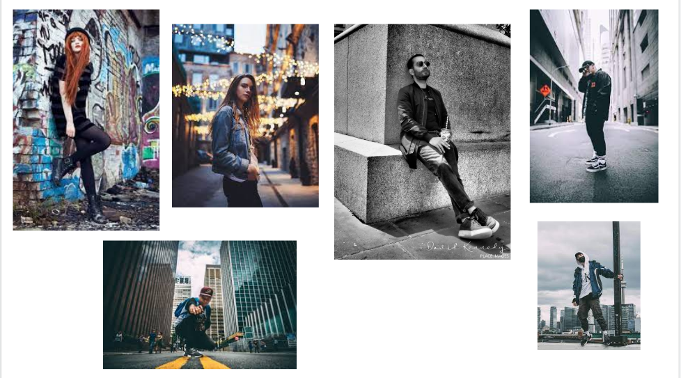
I am starting my projects by taking inspiration from these four images. I would like take inspiration from them because I believe that these images have texture which is what I would to achieve since I believe that they look the most simple but most interesting to look at which is my goal. I am going to take pictures of people like this in the studio to get the best result. Then I would like to take the photos I've taken and edit them in photoshop to enhance them for the best outcome.
The equipment I will be using will be a DSLR Canon camera which will be put onto a tripod to get the best professional image. I will also try to use studio lights to make the image more brilliant, unique and professional. I will use a background of either black or white because it will give me a more moody and more serious look which is my goal in this shoot. My camera setting will be changed throughout so I don't miss out on the opportunity to get the best image. The white balance will be on auto or it might change due to the circumstance. My ISO would be on auto and wouldn't change since it's taken in a studio setting. I am aiming to take 15-20 photos of each person in different poses because i believe that any less than that would be unprofessional and any more than that would be too untidy. I will take photos of my friends and maybe more who would want to. The people that I will be taking photos of wouldn't wear something too extreme, i am trying to make them wear something basic and I would like them to have nothing on there face just their natural self
The equipment I will be using will be a DSLR Canon camera which will be put onto a tripod to get the best professional image. I will also try to use studio lights to make the image more brilliant, unique and professional. I will use a background of either black or white because it will give me a more moody and more serious look which is my goal in this shoot. My camera setting will be changed throughout so I don't miss out on the opportunity to get the best image. The white balance will be on auto or it might change due to the circumstance. My ISO would be on auto and wouldn't change since it's taken in a studio setting. I am aiming to take 15-20 photos of each person in different poses because i believe that any less than that would be unprofessional and any more than that would be too untidy. I will take photos of my friends and maybe more who would want to. The people that I will be taking photos of wouldn't wear something too extreme, i am trying to make them wear something basic and I would like them to have nothing on there face just their natural self
Shoot With Justin


Best and Worse

In my opinion I like the one on the right a lot better as it has props and the shadow stands out a lot and the iso is just perfect for this. Whereas the one on the left has no props and it quite plain and hes not even looking at the camera.
Black and White


Best and Worse


From my black and white images that i had taken i really like the one on the left as it has a devious look, it stands out and has a darkness effect, the pose he is making eye contact with the person who is looking at the image. However the one on the right doesn't really have a dark side and he just looking directly at the camera with no posture.


Best and Worse


I really like the image on the right as it looks like it has been photoshopped when it hasn't, I made the model to position his glasses perfectly so that it has that glasses effect, The image on the right was my first attempt off it that's why it didn't come out as good.


From all these images I didn't really like any off them as it doesn't really have any shadows or effects, I didn't position my lightning properly, which is the reason it didn't come out in a good way and is really plain.


From these two double exposure images that I tried working with, the image on the left came out perfectly whereas the image on the right was my first attempt hence why it is not perfect and the double exposure is off.


Best and Worse

|

|
I really love the image on the right as it is a fast motion picture and i managed to take the image as the ball was falling into Farhan's hand whilst still maintaining the focus and making it come out out very clear. However the image on the left is very dark and I couldn't get the lightning to be perfect as i was my first attempt.


Best and Worse

In the first image i used full lightening effect and added a tone off blue for one off the lights which created an amazing effect and shines beautifully across his eye, I didn't like the image on the right as it was really plain and there were no effect made on the image and he isn't making eye contact like the first image.


Best and Worse

From all the double exposure images we had a go on, the image on the left was by far the worst as the double exposure didn't come out as we expected it to come out, how ever the image on the left, we went for a two faced effect, so the person looking at the image has to think off a meaning behind the image whihc creates a really fantastic effect.


I don't have a best and worse for these images i feel like they all came out pretty good with the fish lens, however I didn't like how you can see the green background I tried to make it so it was all black and the only visible thing was Justin.
Final Gallery


Refining My Images In Photoshop
Neon PhotoShop
This is where I got my Idea from:
I really like this tutorial and idea because its unique and not many people have done this. It also looks amazing and bright. I also quite like the way of exploring light which I can do both through the camera lens and post production.
I really like this tutorial and idea because its unique and not many people have done this. It also looks amazing and bright. I also quite like the way of exploring light which I can do both through the camera lens and post production.


I watched the tutorial off the video I linked above, I followed it and i was inspired by the way it looked and thought it was a very good idea since no one else had done this before. Unfortunately i didn't get to save it as a PSD which meant i couldn't go back and edit the image after which I believe I could've improved a lot. I hadn't saved it properly which I realized is a big mistake I made.
How did I do photoshop this?
I started off by making the area off the image larger to make more space for the neon lighting since the image was too small, I blended each corner to make it look seem less. I edited a triangle around Farhan's head and made it purple. I proceeded to make the triangle look more 3D and make it pop out a lot more. I continued to edit this for a while and made it look really nice and made the triangle have a reflection on Farhan's face, which is why Farhan's face has a purple reflection on it which made it look really good and realistic. I'm ashamed on myself as I could've improved this a lot more, however i cannot edit this again since I didn't save I properly. I know my mistakes for next time now !
I wish I had a chance to make the background gradient color and make it very reflective and interesting.
Final Image

Magdiel Lopez Photoshop
Tutorial:
I liked this tutorial because I really liked the slice effect, I tried to make it look a bit graphic effect rather than realistic like the tutorial. I think this is a good starting point and it will push my outcomes a lot more.
I liked this tutorial because I really liked the slice effect, I tried to make it look a bit graphic effect rather than realistic like the tutorial. I think this is a good starting point and it will push my outcomes a lot more.
Steps:


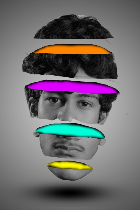
I researched Magdiel Lopez as one off my photographers and I looked up to him as an inspiration as his photoshops ideas are amazing and very very unique, no other photographer has done a idea like this or anything even similar, hence the reason why I picked his photoshop, I followed the tutorial step by step and edited it, I made it have a cartoon effect rather than making it look realistic as I didn't really like the realistic effect too much. It was a great Photoshop as I could do more things with it and change the color's too, to get different outcomes.
How did I do it?
I started off by cropping Farhan's face out and making his face the only layer with the crop tool. I had to carefully go around his entire face with one off the tools and ensure I don't miss any points. Once I had cropped his face I got a pen and drew layers over his face to see where I was going to cut, I cut his face into 4 different pieces and added color just in-between them all. I then added a shadow as you can see above which really created the 3D effect. Doing this impacted the photoshop massively as it pops out more. I then added a grey and white gradient background which also made it look really nice and then added a shadow below the chin to make it look more 3D. It came amazing and I'm really proud off myself It was a great photoshop Idea!
I started off by cropping Farhan's face out and making his face the only layer with the crop tool. I had to carefully go around his entire face with one off the tools and ensure I don't miss any points. Once I had cropped his face I got a pen and drew layers over his face to see where I was going to cut, I cut his face into 4 different pieces and added color just in-between them all. I then added a shadow as you can see above which really created the 3D effect. Doing this impacted the photoshop massively as it pops out more. I then added a grey and white gradient background which also made it look really nice and then added a shadow below the chin to make it look more 3D. It came amazing and I'm really proud off myself It was a great photoshop Idea!
Final Image
Different Outcomes:

|
I did the same photoshop but simply changed the color to get different outcomes which I think was good idea as It creates many different ideas and looks amazing! As you can see, just b6y changing colors on a photoshop the image looks completely different and has a totally different perspective.
|
Refined Images

|
I refined the colors on my colors on my image as I didn't like how I presented it, I also changed the edges off the image as it wasn't curved and neat so I just made it look a lot more neat and presentable .
|
Neon X Sliced Face

- I combined the neon photoshop and the sliced face [photoshop i did as i believe its very unique and no one has done that yet and its very special and different, I believe it came out nicely photoshopped . I came up with the idea by myself with no inspiration off anyone and it was originally my idea.
Basket Photoshop
Tutorial:
I did this tutorial as I thought it was something that was extremely unique I hadn't seen anyone do this before and I got it recommended to me and I'm very pleased I followed this tutorial.
Steps:


Final Outcome:
This was my final outcome and I wish I found out how to overlap the layers just how the video is, I looked though the tutorial many time but couldn't find out how to overlap it however I still think it looks good. It looks like a basket cover over his face. It was a very unique idea and ive never seen anything like it. This took me about 1 hour to complete it was too difficult.
Meaningful Outcome
Tutorial
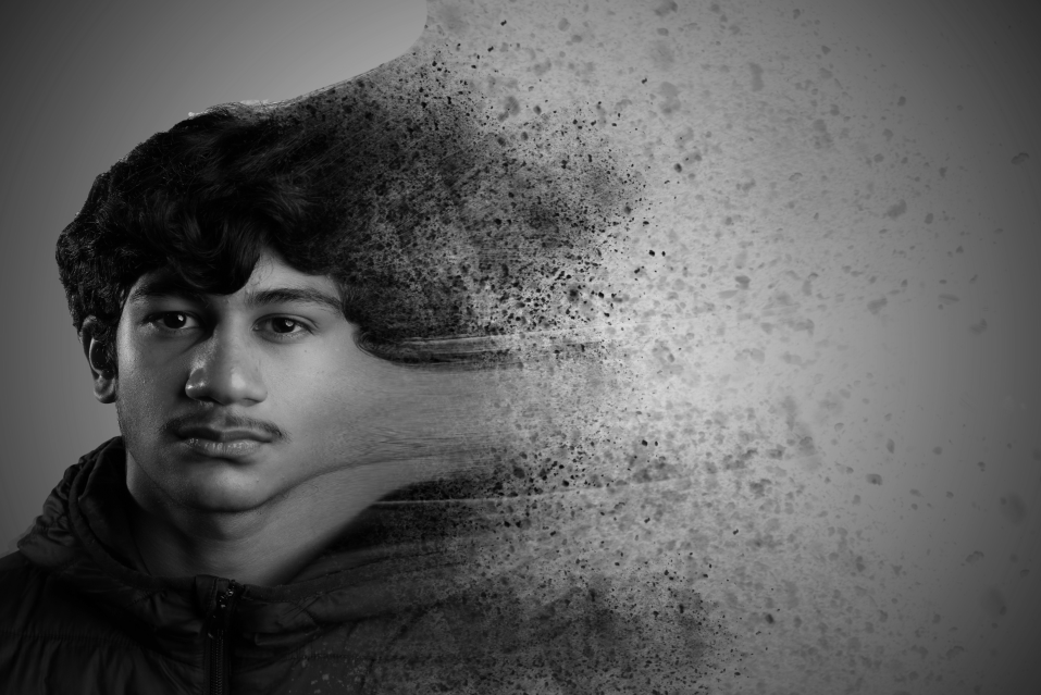
I did this tutorial because I wanted to do a outcome with a special meaning behind it and have a good effect when people look at it. My photoshops didn't really have any meanings so I made this one have a meaning with depression and someone fading away.
Steps:


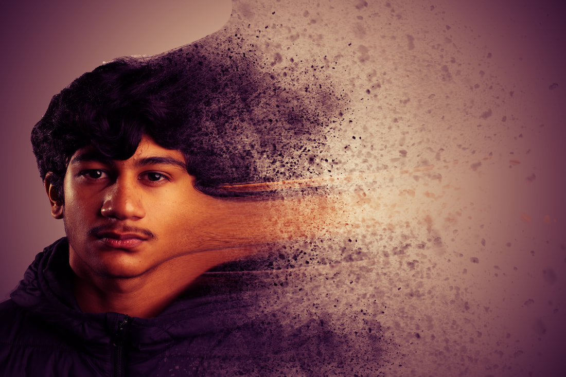
This was my final outcome which I'm very proud off as it has a amazing effect to it. Him slowly fading away shows he has been through something and part off him is fading away as he continues on with his life. The quality off it looks amazing and I add light to the Centre off the image so make it glow and changed the filter off it to a personalized one I did myself.
Black And White Outcome
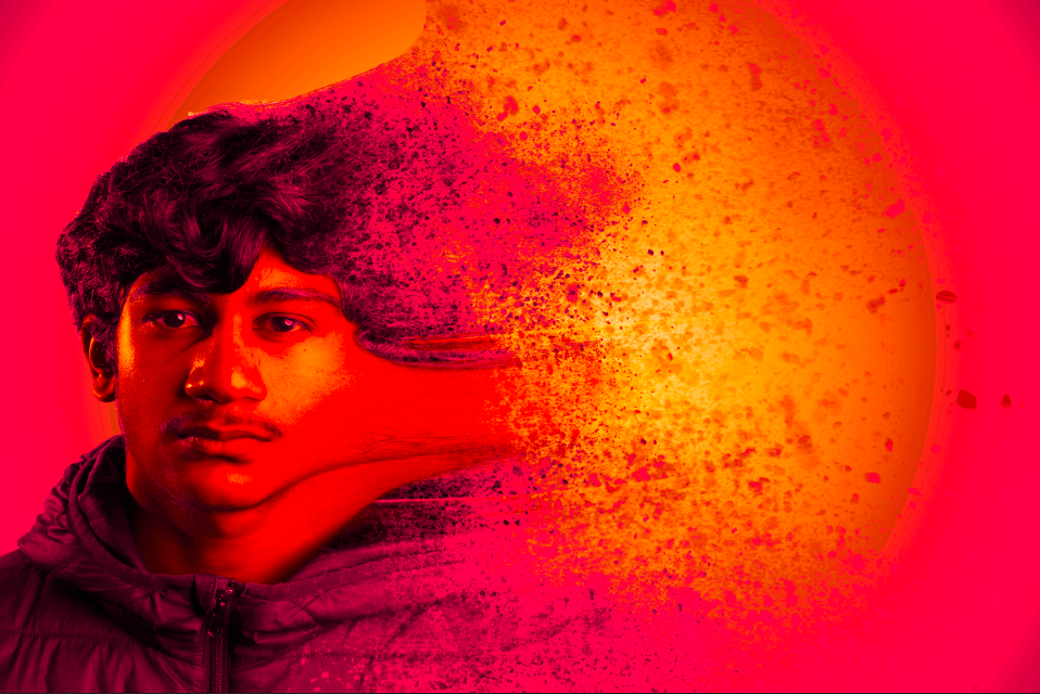
I decided to change the color off the image as it would create a more dramatic effect to it, especially black and white as it has the best effect and it shows a deeper meaning.
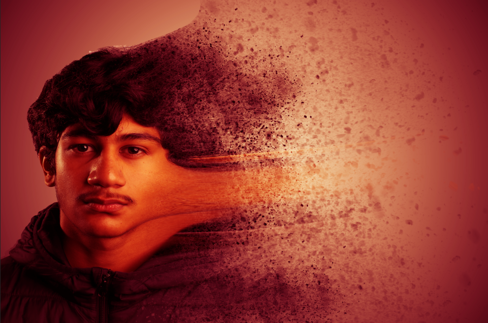
Just experimenting with this image goes along away, simply changing the saturation and exposure gives it a more darker and violent look. Seems as though its blood.
Different Outcomes
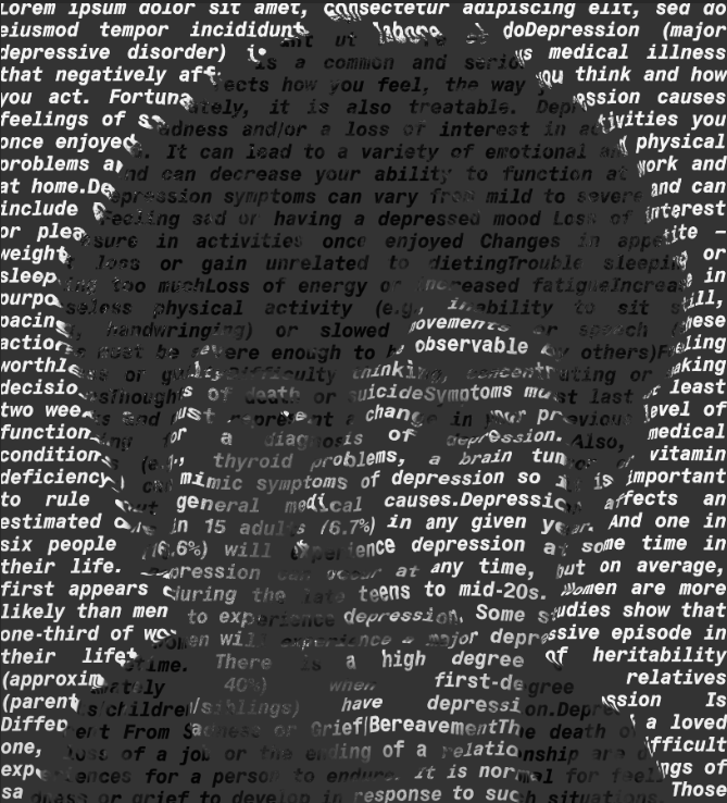
Tutorial : I chose this Photoshop because I really liked the idea of making a photoshop with a message on the face and I speeded the message of depression and explained the meaning and results of it.
Steps:


To do this I found a article about depression online and i copied and pasted it into this website which I could easily remove all the paragraphs from, I put all the text in one paragraph and copied and pasted it onto the image which I cropped first. I then added many effects etc from there and changed the text and font to make it bold and look more creative. I then worped the text and disorted it so the text goes around the face. I then added anotehr layer and filled it to get the final outcome and show farhans face is slowly fading away.
Evaluation
My main theme was Portraiture and I wanted to have a strong main theme with a strong meaning and message behind it, which was depression and how people slowly fade away and how they could need help and need to reach out to someone before they lose themselves. Instead of meaningless photoshops, I also took my images in a certain way like Magdiel Lopez, the images he took were straight forward portraits, he did this so he could later on edit them in photoshop and change them. Which was effective because the people who look at these images can create their own meaning behind it. I thought the theme was good because I was able to take images of different styles and poses and create a meaning behind the image. It allowed me to be extremely creative by doing different photoshops which is important as you can experiment with your images. I improved my photoshopping skills a lot with these images and projects. I mastered the skill of taking images with good lighting as Justin taught me with the workshops.
I genuinely enjoyed it a lot and doing these images and improving them developed my skills and swallowed me to be more creative. However I did get frustrated when my images didn't come out as I Wanted, however that is how I learnt from my mistakes and learnt to improve. Setting up the photoshoot was also fun as I learnt what makes things more creative and what makes things worse and made my images effective. Setting up the lights and studio camera and the different lenses was an amazing experience. Learning the manual camera was difficult as I was used to using a camera with automatic setting all my life. However you get the hang of it. Following the tutorials was difficult however it was an experience as you could slightly change your own steps and what you would like yourself which was fun and I looked forward to it each time. The ISO levels changed depending on what we did with the lighting and our White balance too.
I would develop my ideas more by maybe making it so that I add my own little twist to the Photoshop tutorials which I did do, however I didn't do it a lot and if I changed them a bit it would've come out better and it would've been more creative. I will definitely know to change the photoshops a lot more and maybe freestyle with them and advance them with my own ideas for my next project. The photographers I researched gave me extremely good ideas, especially Magdiel Lopez, he influenced me a lot to do the majority of my Photoshops and to take my images in a certain way with the rainbow effect and colourful theme.
I feel as though the best part of my project is developing my ideas to get them more interesting and creative, for example my rainbow head which I added the neon light to was my idea, I also enjoyed seeing progress in my work, as I carried on with this project seeing my Photoshops getting better and more advanced made me really happy. Even my latest photoshop I did is amazing in my opinion and is my favorite. I put a lot of time into it. The software I used the most was Photoshop as it has the best and tools on it and has the most possibilities to improve your work. I used black and white techniques and double exposure and fade away techniques.
Covid definitely had a massive impact on all my work this year. I could've taken more images and I couldn't develop my website as much as we didn't have many images to do it with because I didn't take any in school as much and we only went to one location and one professional studio workshop. It also made me lack concentration and didn't motivate me as much, however I still put all my effort into it. We could've gone to London and many other places to take amazing images and advance my photoshop and work, however it was a shame we didn't. If I was to do this project again I could've taken more images at home and set up the camera by myself for portraits.
Overall I had a lot of fun and enjoyed the project a lot. It's a shame covid came and we didn't get to do it to the full capability of our abilities. Hope you enjoyed my work and my journey.
Final Gallery


|

|
